Area Chart
Showing total visitors for the last 6 months
Component slot – add any component
Every page in this template follows a consistent layout built with utility classes and key components. This structure gives you flexibility while keeping everything clean and scalable.
Two key components appear consistently across pages:
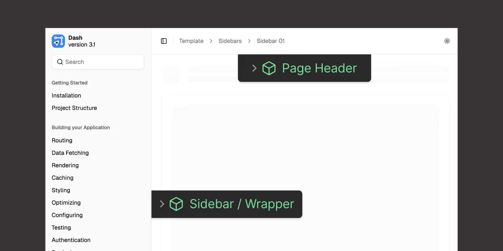
At the core of the layout is the .page-wrapper class, which acts as the outer shell for every page.
Inside .main-wrapper:
We’ve chosen to use utility classes like .page-wrapper, .main-wrapper, and .dashboard-wrapper instead of only components. This gives you more flexibility to place both components and regular static elements wherever you need them — since Webflow’s component slots currently don’t support non-component elements.
This structure keeps everything organized — while staying flexible for custom dashboards, internal pages, settings layouts, and more.