Components
All components in this template are built entirely using Webflow’s native Components feature — giving you full control, flexibility, and scalability without any custom code.
How it works
Each component is made to be as flexible as possible using Webflow’s Component Properties and Content Slots. This means you can quickly change text, icons, links, variants, and more — directly from the properties panel. You can also drop additional content inside the slots.
Some components are simple, like the Badge component — it’s just one item with a few properties.
Other components are more complex and made up of multiple nested components. For example, the Menubar component is made of:
- A Menubar Wrapper
- Multiple Menubar Triggers inside
- Each trigger opens a dropdown containing:
- Menubar Items
- Menubar Separators
- Menubar Subtriggers (which open another level with more items)
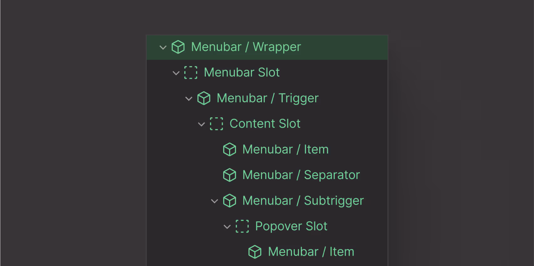
This layered structure gives you the flexibility to build rich interfaces while keeping things modular and organized.
If you’re new to Webflow components, or want to understand how properties and slots work, check out the official Webflow documentation: 📘 Webflow Components Overview
Start browsing DashKit's components by using the sidebar panel on the left.
You’ll find over 50 native Webflow components, including complete authentication flows. Begin with the Accordion component to see how each element is structured, or continue exploring the rest.